Airbnb Venues
A new feature concept to connect, book, and list venue spaces locally.
Background
My role
I worked as the sole UX Designer for my capstone. I conducted user research, user interviews and surveys, wireframes, user testing and prototyping, and final hi fidelity screens.
Airbnb is one of the most popular online marketplaces for booking short-term lodging and vacation rentals. However, it currently does not have a specific feature for finding venue spaces such as conference rooms, event spaces, and meeting rooms. This creates a challenge for individuals and businesses who need to find and book such spaces for events, meetings, or other purposes.
Figma, Miro, Survey Monkey
Scope
Adding a new feature to an existing platform.
UX/UI Design, User research, User interviews, User testing
Tools
Airbnb is an online platform focused on short-term homestays and vacation rental homes. It works as a marketplace that connects people who want to rent their homes or property as hosts, to people who are looking to book specific accommodations in specific areas. Their mission is to create a world where anyone can belong anywhere.
They first advanced this mission by adding Airbnb Experiences, immersing travelers in local communities around the world by offering one-of-a kind activities led by local experts. To continue to further this mission of belonging and community, I looked at current gaps in Airbnb.
Problem
Currently, Airbnb properties are sometimes used beyond just stays, but as a place to hold events such as weddings, showers, or parties. https://www.brides.com/airbnb-wedding-venues-5025057
Goal
By adding this feature, Airbnb can expand its market reach and attract a new set of users who are looking for venue spaces. It can also provide additional revenue opportunities for Airbnb and its hosts, while improving the overall user experience of the platform.
Research
Understanding the User
I conducted interviews, surveys, and a competitive analysis to develop my understanding of how people are currently using Airbnb as both hosts and guests, the ways in which people are finding venues for their events, and where there are current gaps.
Competitive Analysis
I started the research by exploring current mobile applications on the market that offer event rentals. I focused on the organization of the apps and their ease of use.
Splacer
Get Spaces
Can set guest amount, type of event, full service option (food).
Only includes spaces in big cities.
Clearly shows availability.
Only in Singapore. Long term and short term rentals.
Peerspace
Swimply
Hosting onboarding upon opening app.
Limited to only places with pools, tennis, and small gatherings.
Many cities available and can select space type.
Hosting features only accessible on browser.
User Interviews and Surveys
I conducted user surveys with 17 participants and interviewed 5 participants to learn about their motivators, pain points, and needs. The participants were those that host and/or have been guests for Airbnb, and those that have looked for and booked event rental spaces from an online platform.
Key Takeaways
As a result of the research, I gathered four key insights that I used to guide the project:
Time of year, cost, budget, and availability are factors in finding a venue.
1.
A platform to list venues could alleviate cost and put more availability on the market.
2.
Liability insurance is important for hosting so the host can feel confident about their property.
3.
Income and covering costs are the main reasons participants would host their property.
4.
Design Process
Visualizing Solutions
Site Map
I drafted a sitemap to show how the user will navigate to the new venue feature while still staying consistent with Airbnb’s current platform.
Task Flows
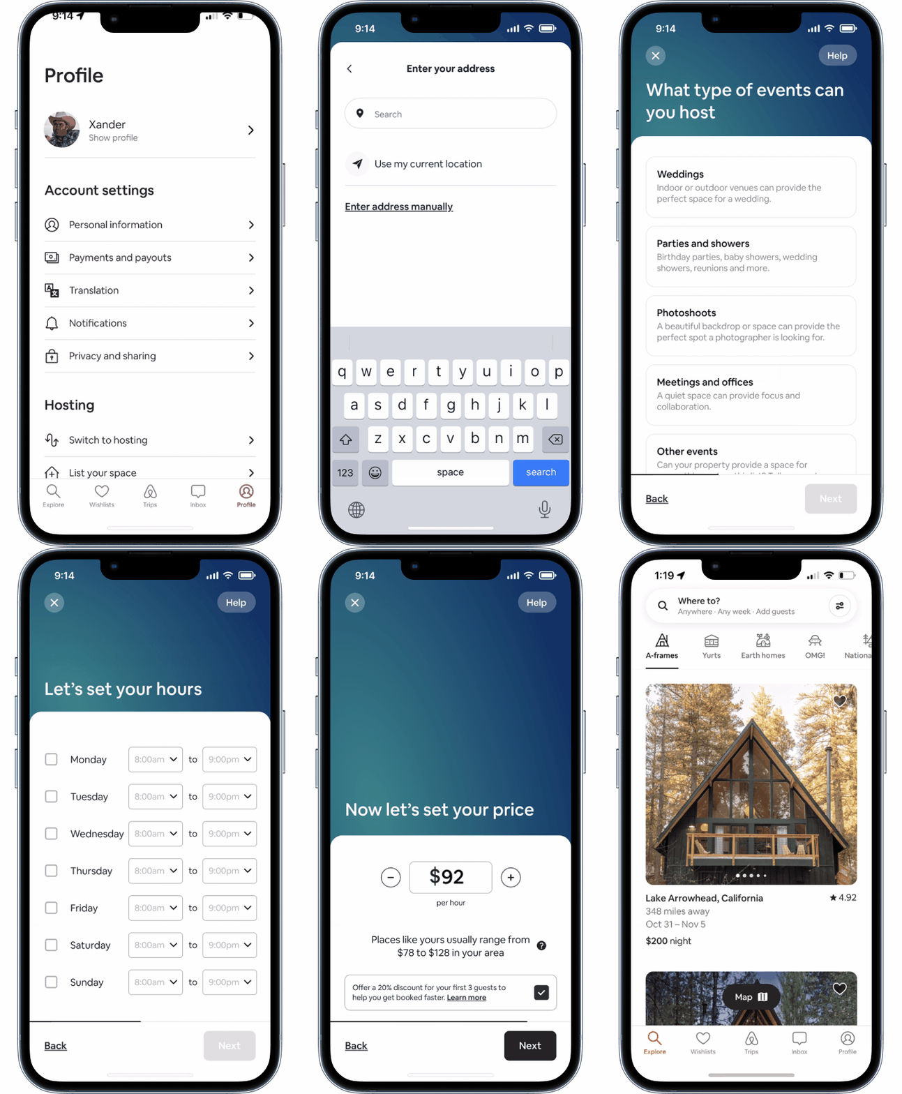
I began mapping out the flow of the user when booking a venue, taking into consideration of the flow users currently use to book a stay. In order to complete the feature from either side, I also made a flow for a host to set up and add a property to rent out as a venue.
Booking a venue
Listing a venue
Wireframes
Booking a venue
Venue Page
Property Page
Booking Details
Confirmation
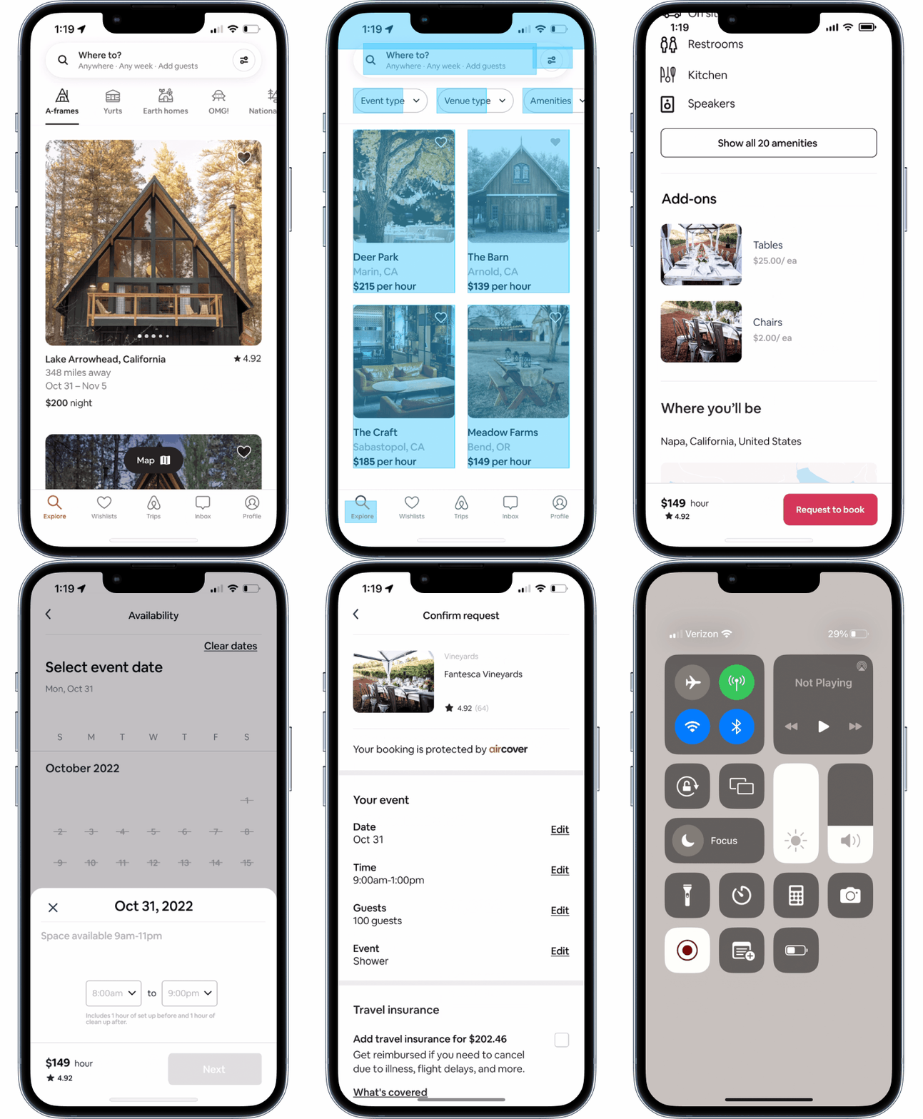
Current UI elements were used in the designs to seamlessly incorporate the new feature. Components from both Airbnb Stays and Experiences were used. When the guest submits the booking details, it is sent as a request. The host will accept or deny the request.
Listing a venue
Welcome Page
Details
Add on services
Confirmation
The Listing a venue flow was designed similarly to the current flow for listing a rental on Airbnb’s app. UI elements already in the design were used, such as toggles to set quantity. The host can add special services to customize their venue.
Hi Fi Wireframes
User Testing
Prototype and Testing
Two task flows were tested by five participants- Booking a venue and Listing a venue.
Iterations from Testing
Full filter on venues page
The initial design of the Venues page to browse for a venue, only had sorting and filtering by each individual category by selecting the category from buttons. This design was similar to that of the Airbnb Experiences page. During testing, I noticed many users took a while to find the filter to select a venue type. This indicated to me that they needed another way to find what they are looking for. I added a full filter that includes all the categories on one screen so they can customize the venue they are looking for with more ease.
Minimum guest capacity
During usability testing, some of the users questioned if there was a minimum amount of guests.
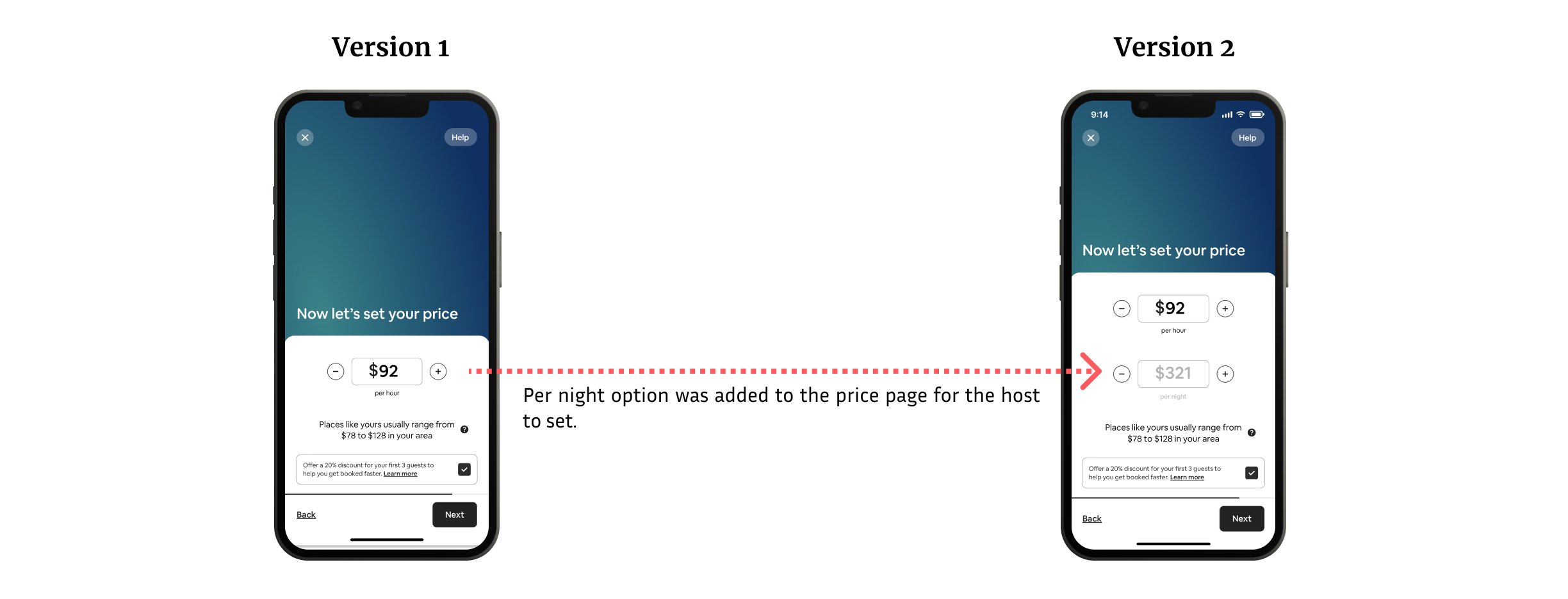
Per day pricing
During usability testing, some users asked about per day pricing if they book for multiple days. I added a “per night” option for the host to set price on (the same nomenclature used for listing a stay.)
Final Design
Book a venue
List a venue
Final Thoughts
This project taught me important aspects of adapting and implementing new features into an existing product. Being a UX designer means constant change, feedback, adapting, and iterating. I had to respect the current design of Airbnb’s platform, while also integrating a new feature with new UI elements. Figuring out how to seamlessly design new elements that would integrate within the existing platform was challenging- I had to dig deep in both the design and also the overall mission of Airbnb to ensure I was staying aligned with their beliefs. Coming back to their mission, of a sense of belonging wherever you are in the world, hones true in a feature that brings people together in life’s celebratory moments.


